Discord
Project Context
Heuristic evaluation of app + redesign according to Nielson & Norman Group’s 10 Usability Heuristics for User Interface Design
Worked as a group of 3 to complete the project
RESEARCH ROADMAP
Evaluation Criteria
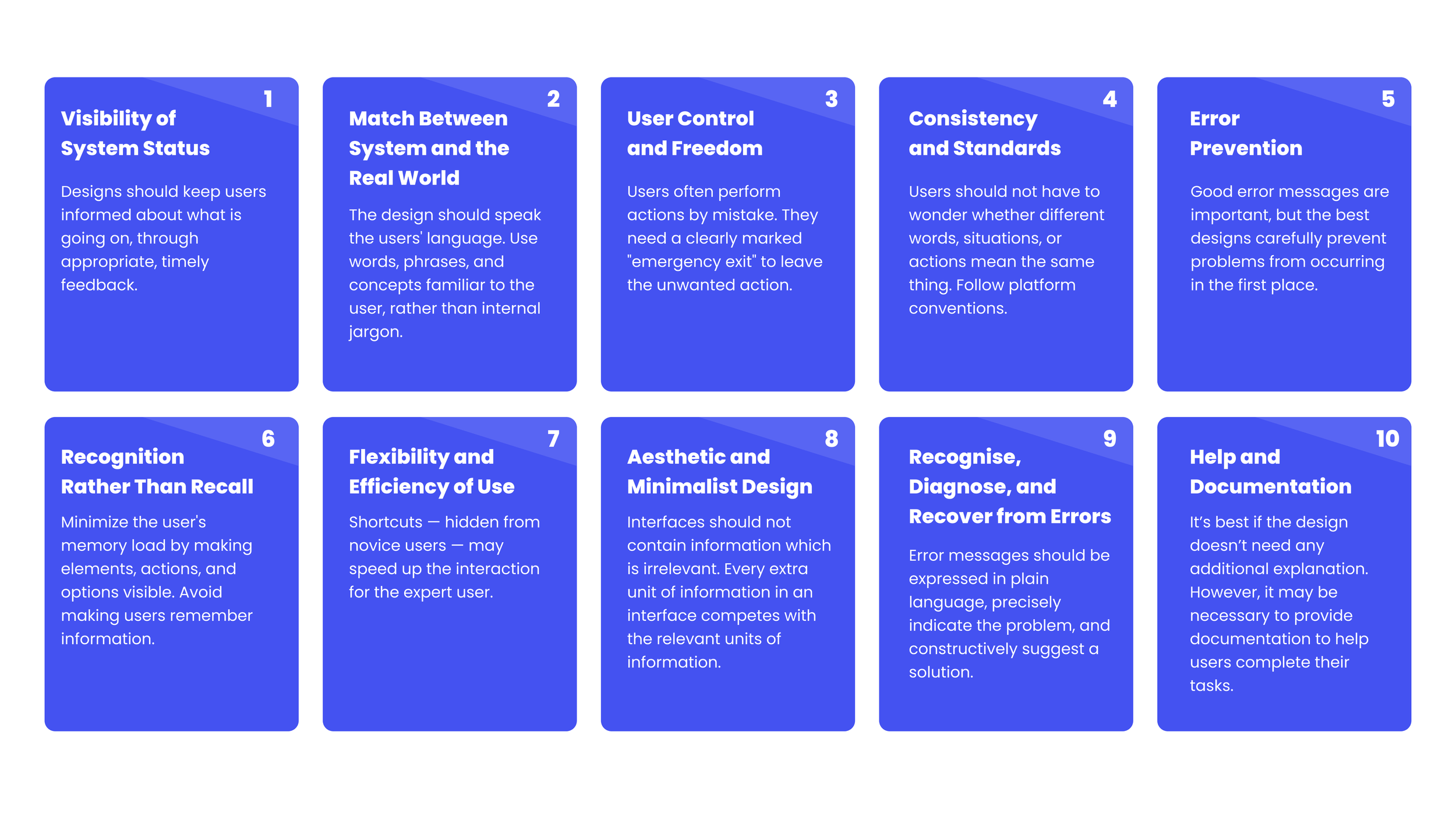
10 Usability Heuristics for User Interface Design
Jakob Nielsen and Don Norman came up with ten general principles for user interface design. They are called "heuristics" because they are more in the nature of rules of thumb than specific usability guidelines. As part of a course project, I and a group of colleagues were tasked with conducting a heuristics evaluation of the Discord app.
TASK FLOW
We first started with a flow for one specific task:
FINDINGS
5 usability issues that could be improved.
#1: Recognition rather than recall
Minimize the user's memory load by making objects, actions, and options visible. The user should not have to remember information from one part of the dialogue to another. Instructions for use of the system should be visible or easily retrievable whenever appropriate.
#2: Aesthetic and minimalist design
Dialogues should not contain information which is irrelevant or rarely needed. Every extra unit of information in a dialogue competes with the relevant units of information and diminishes their relative visibility.
#3: Help and documentation
Even though it is better if the system can be used without documentation, it may be necessary to provide help and documentation. Any such information should be easy to search, focused on the user's task, list concrete steps to be carried out, and not be too large.
#4: Visibility of system status
The system should always keep users informed about what is going on, through appropriate feedback within reasonable time.
#5: User control and freedom
Users often choose system functions by mistake and will need a clearly marked "emergency exit" to leave the unwanted state without having to go through an extended dialogue. Support undo and redo.
PLAN
We chose to address 3 of the most pertinent issues.
Due to time constraints, we chose to address the 3 most feasible and pertinent issues of the 5. The matrix below shows how the issues were valued based on user value and effort required on the part of the organization.
RESULTS
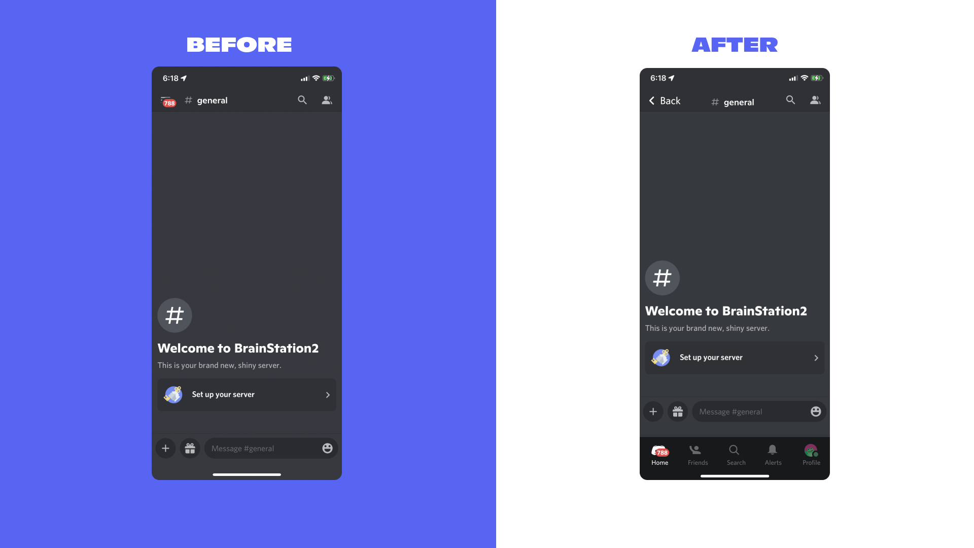
Below are the before and after screens regarding the above issues.
KEY LEARNINGS
This was my first time conducting a heuristics evaluation of an app. I learned that the more people who conduct the evaluation, the better. In general, heuristic evaluation is difficult for a single individual to do because one person will never be able to find all the usability problems in an interface.
I had a chance to compare Norman & Nielsen’s evaluation criteria with Bastien & Scapin’s grid. The two differ slightly in that Norman & Nielsen’s evaluation takes graphic aspect, the Ui design, and its impact on the user experience into consideration, while B & S’s doesn’t. That said, Bastien & Scapin’s criteria are more broad and are designed to maximize usability whatever the appearance of the interface or the technology used. All in all, an approach that combines both evaluations seems best when possible.
Research is SO important. Although it’s not a flashy part of the UX process, it’s one of the most crucial to conduct before beginning to design. In this project, I realized how much research goes into every detail of apps designed by large companies. At first glance, a feature would seem irrelevant; however, after evaluating it, its function would become apparent.


